
Customizing Your Dashboard
The visualizations in your Metron dashboard are stored in resizeable containers that you can arrange on the dashboard. This section discusses customizing the containers.
- Adding visualizations
To add a visualization to the dashboard, click the New Visualization (
 ) button on the Dashboard toolbar. Select a saved visualization from
the list. You can filter the list of visualizations by typing a filter string into the
Visualization Filter field.
) button on the Dashboard toolbar. Select a saved visualization from
the list. You can filter the list of visualizations by typing a filter string into the
Visualization Filter field.- Saving the dashboard
To save the dashboard, click the Save Dashboard (
) button on the Dashboard toolbar, enter a name for the dashboard in
the Save As field, and click the Save button.By default, dashboards store the time period specified in the time filter when you save a dashboard. To disable this behavior, clear the Store time with dashboard box before clicking the Save button.
- Loading a saved dashboard
Click the Load Saved Dashboard (
 ) button to display a list of existing dashboards. The saved
dashboard selector includes a text field to filter by dashboard name and a link to the
Object Editor for managing your saved dashboards.
) button to display a list of existing dashboards. The saved
dashboard selector includes a text field to filter by dashboard name and a link to the
Object Editor for managing your saved dashboards.- Moving containers
Click and hold a container’s header to move the container around the dashboard. Other containers will shift as needed to make room for the moving container. Release the mouse button to confirm the container’s new location.
- Resizing containers
Move the cursor to the bottom right corner of the container until the cursor changes to point at the corner. After the cursor changes, click and drag the corner of the container to change the container’s size. Release the mouse button to confirm the new container size.
- Removing containers
Click the x icon at the top right corner of a container to remove that container from the dashboard. Removing a container from a dashboard does not delete the saved visualization in that container.
- Viewing detailed information
To display the raw data behind the visualization, click the caret at the bottom of the container. The dashboard replaces the visualization format with the raw data on which the visualization is based. You can view the data in the following formats by clicking the buttons at the top of the component:
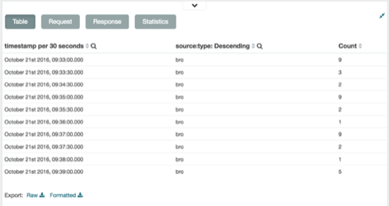
- Table
A representation of the underlying data, presented as a paginated data grid. You can sort the items in the table by clicking on the table headers at the top of each column.
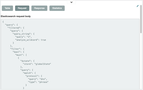
- Request
The raw request used to query the server, presented in JSON format.
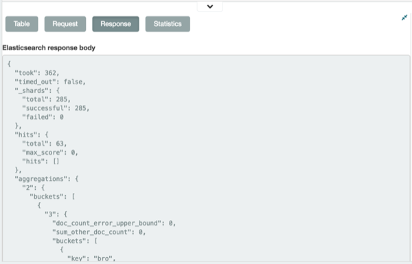
- Response
The raw response from the server, presented in JSON format.
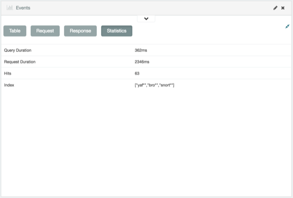
- Statistics
A summary of the statistics related to the request and the response, presented as a data grid. The data grid includes the query duration, the request duration, the total number of records found on the server, and the index pattern used to make the query.