
To track a specific job, particularly a Hive or Pig query that has been broken down into multiple interdependent jobs, use the Job Charts screen to see a more detailed picture. The Job Timeline tab displays a detailed graph and timeline of each map and reduce task and the Job Tasks tab displays task attempt information per task and job.
To open the Job Charts screen, click the appropriate Job id number.
The Job Charts screen pops up in the Job Timeline tab.
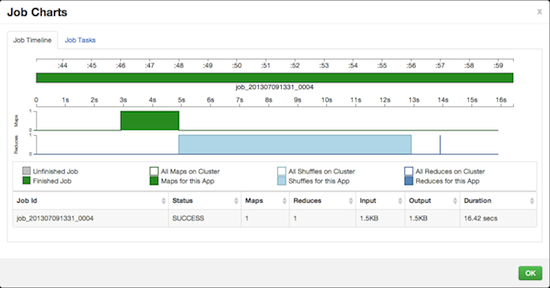
The graph displays the execution sequence of each job and each map and reduce segment against a timeline as well as other information, including the duration of execution, I/O, and number of map and reduce tasks. Jobs are shown at the top of the graph in sequence, while the tasks that make up the individual jobs are shown in a "swimlane" format.
The X-axis displays the overall execution time. The example starts at 0 and increases to 25 seconds on the far right. Map tasks are shown in green, shuffle segments in light blue, and the actual reduce tasks in dark blue.
The Y-axis shows the number of tasks running. The color-filled objects show the tasks for the currently displayed job and the white-filled objects show the number of tasks running in the system as a whole at that moment, so that you can understand the context in which the job is being executed.
Click on the JobTasks tab to view a scatterplot of job tasks.
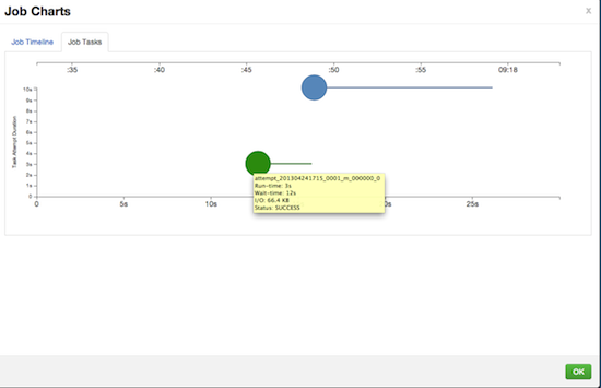
The Job Tasks graph also shows the task execution time on the X-axis but on the Y-axis shows the Task Attempt Duration time (in seconds). Hover on each task circle and see more details, such as Wait-time and I/O. The size of the circle shown is based on the amount of I/O for the task.
